
The Competition
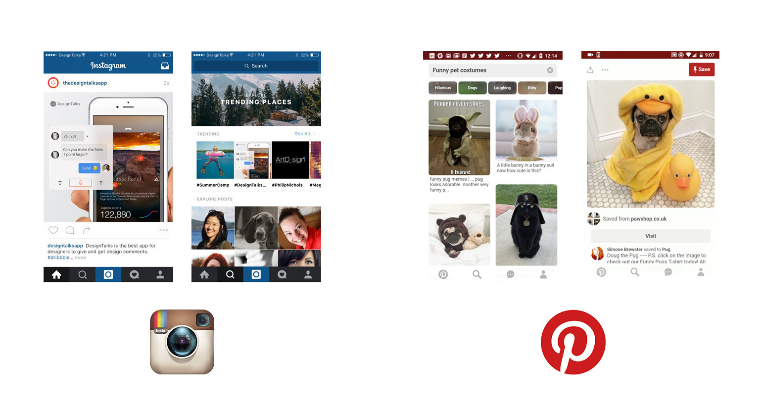
A big part of the UX research was competitive analysis and there were many products in this space. Since this app wasn't about innovation the primary goal was to take familiar user patterns and create a user experience that was catered to our core users which consisted largely of the Asian market.
The Solution
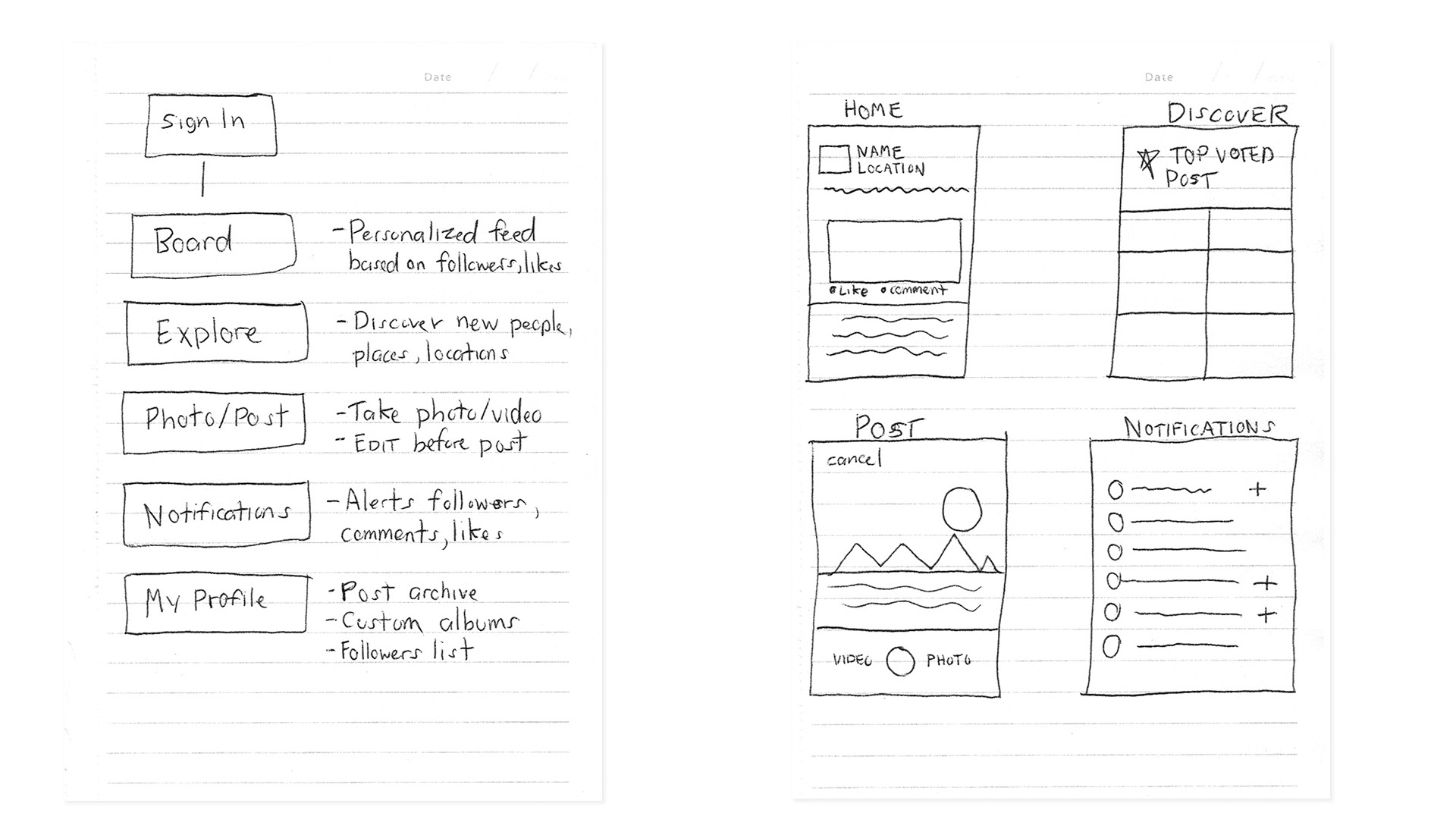
Meeting with stakeholders regularly allowed us to insure the product met their expectations. As usual the first step is to wireframe the structure and layout of each screen and present a flow that would be familiar with other social media products.
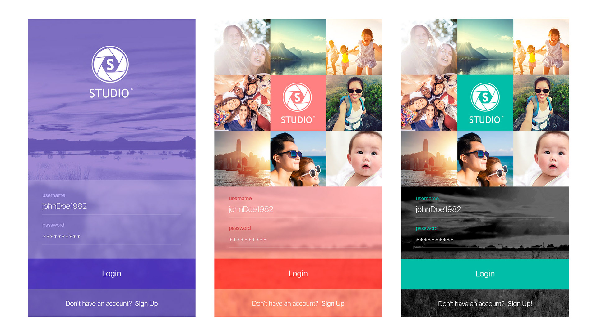
The Color Scheme
Since the stakeholders wanted to see multiple comps I decided to explore different colors that were popular in Asia and created hi-fidelity mocks with each color.

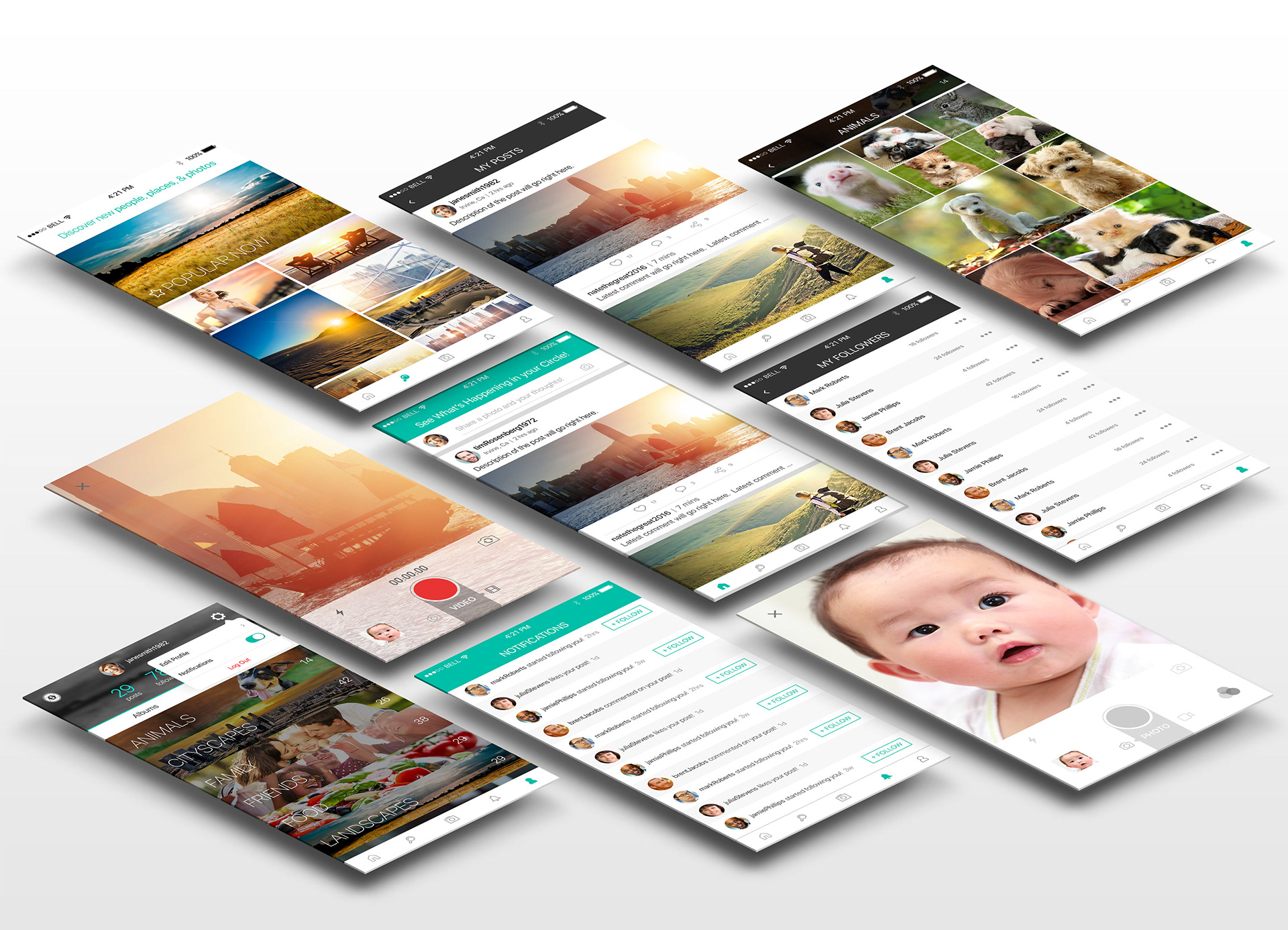
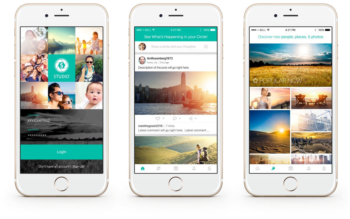
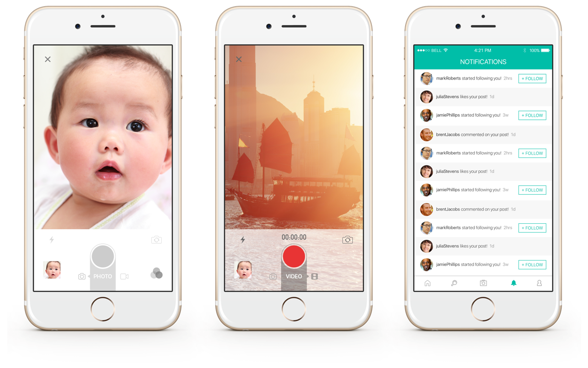
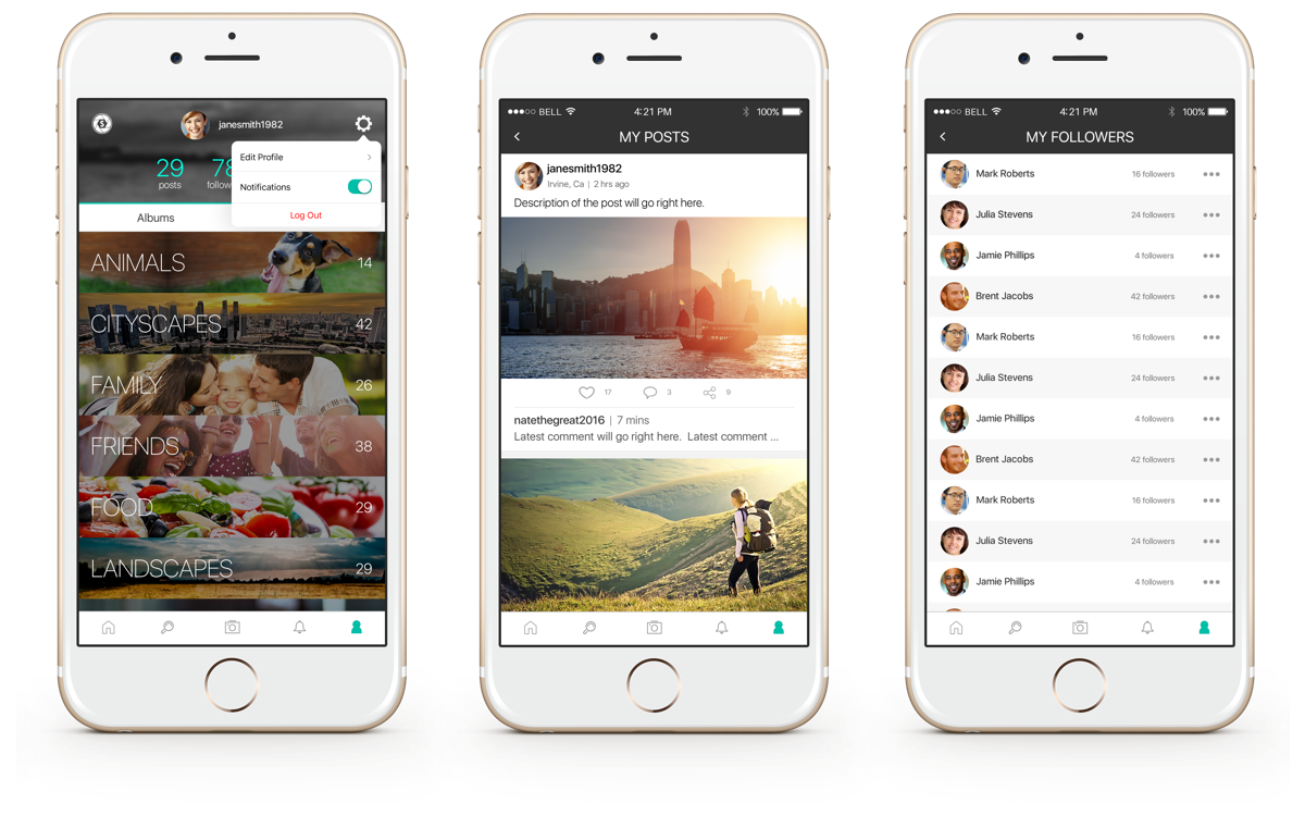
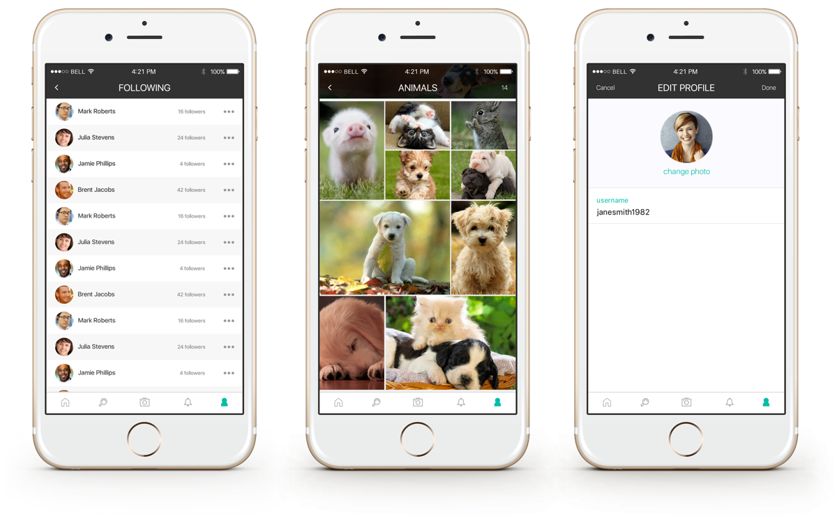
The User Interface
Once a comp was selected the next step was to take the chosen color scheme and complete the visual design of the app with enough features for an MVP release.
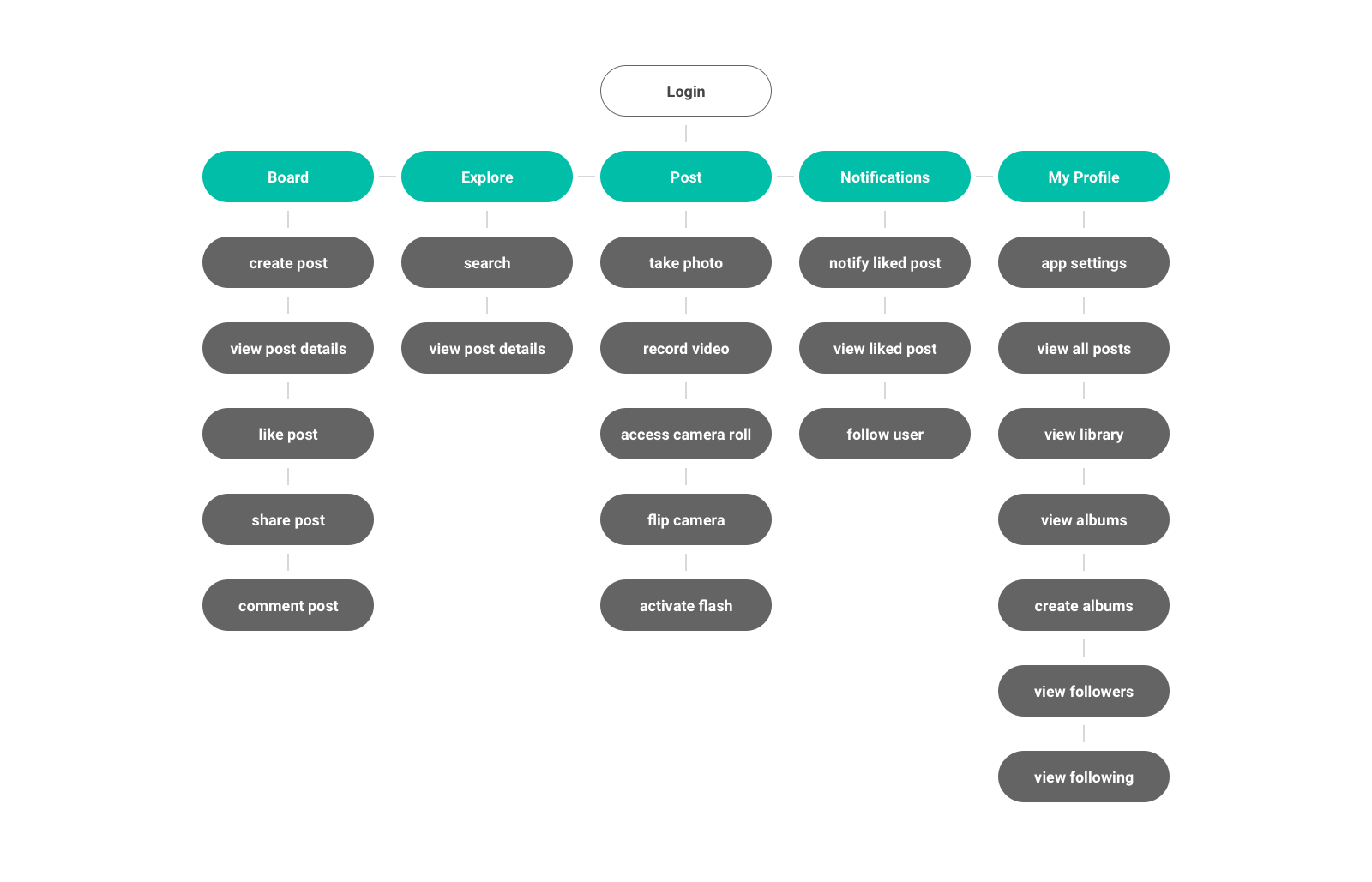
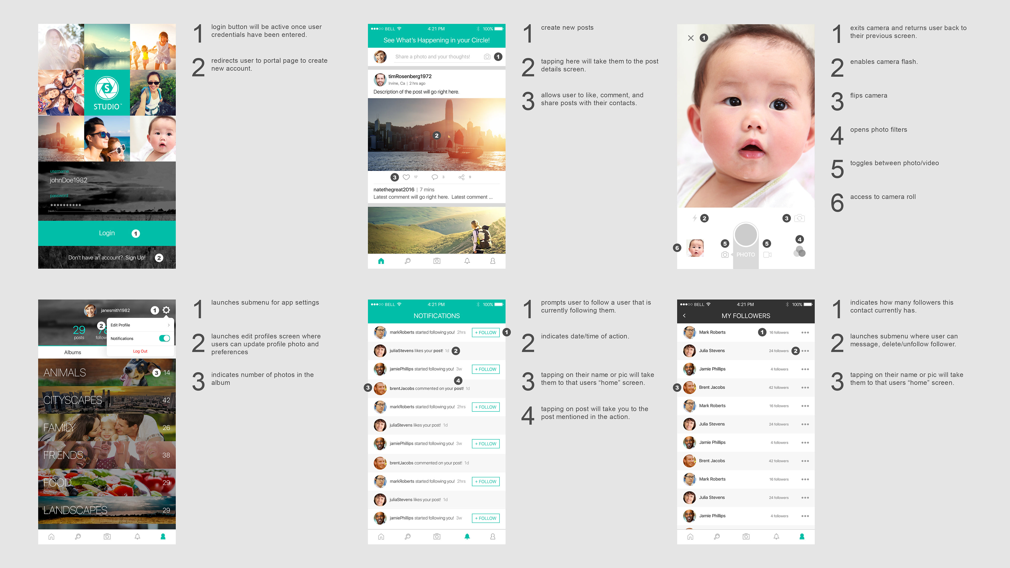
UX Annotations
Since this product involved some stakeholders that were not as tech savvy or were new to the social media scene it was necessary to detail the functionality of the key screens of the app.
Overall the stakeholders were happy with the outcome of the app. After creating a hi-fidelity prototype the app tested well in terms usability since the design language was consistent with other products in the same space.