
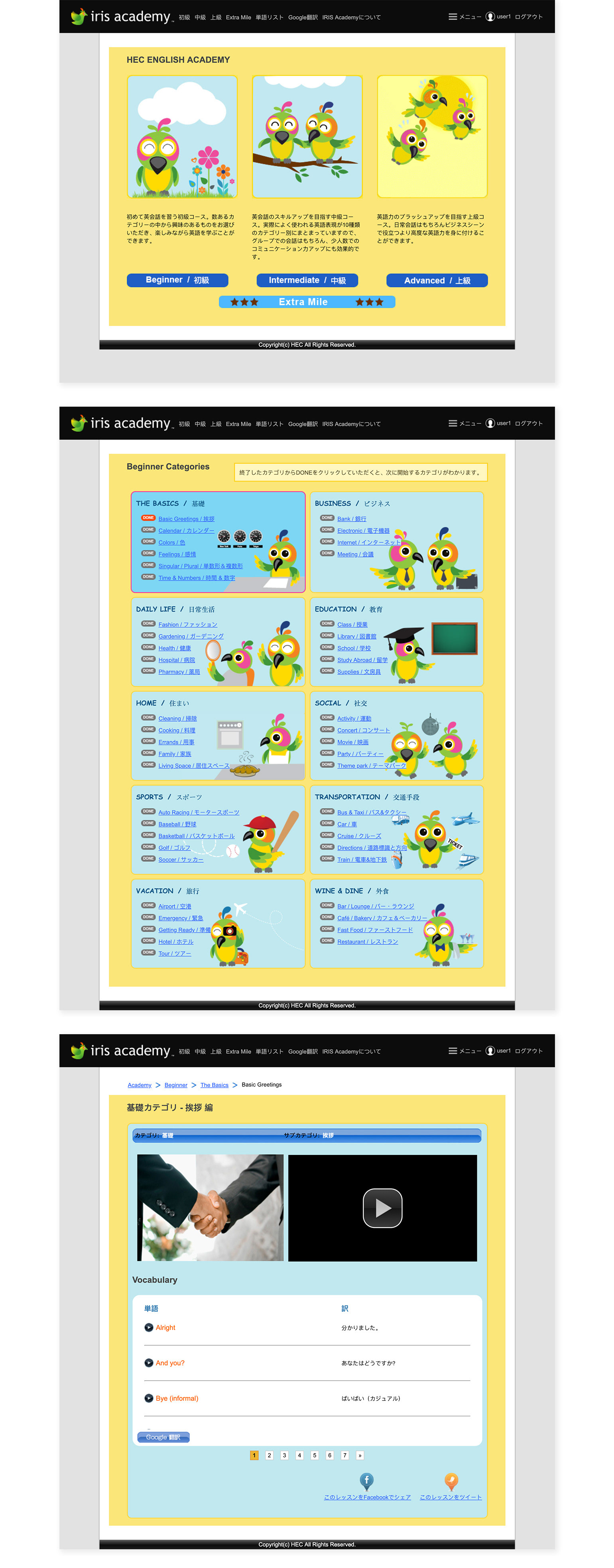
The Problem
Academy housed over 3000 videos of content that existed in a website that lacked a logical structure. The site was supposed to provide guided English lessons through conversation but looked more like a data dump without any architecture. To optimize the experience we decided that the website platform would be a burden and a native mobile app would suit the user best.
The Solution
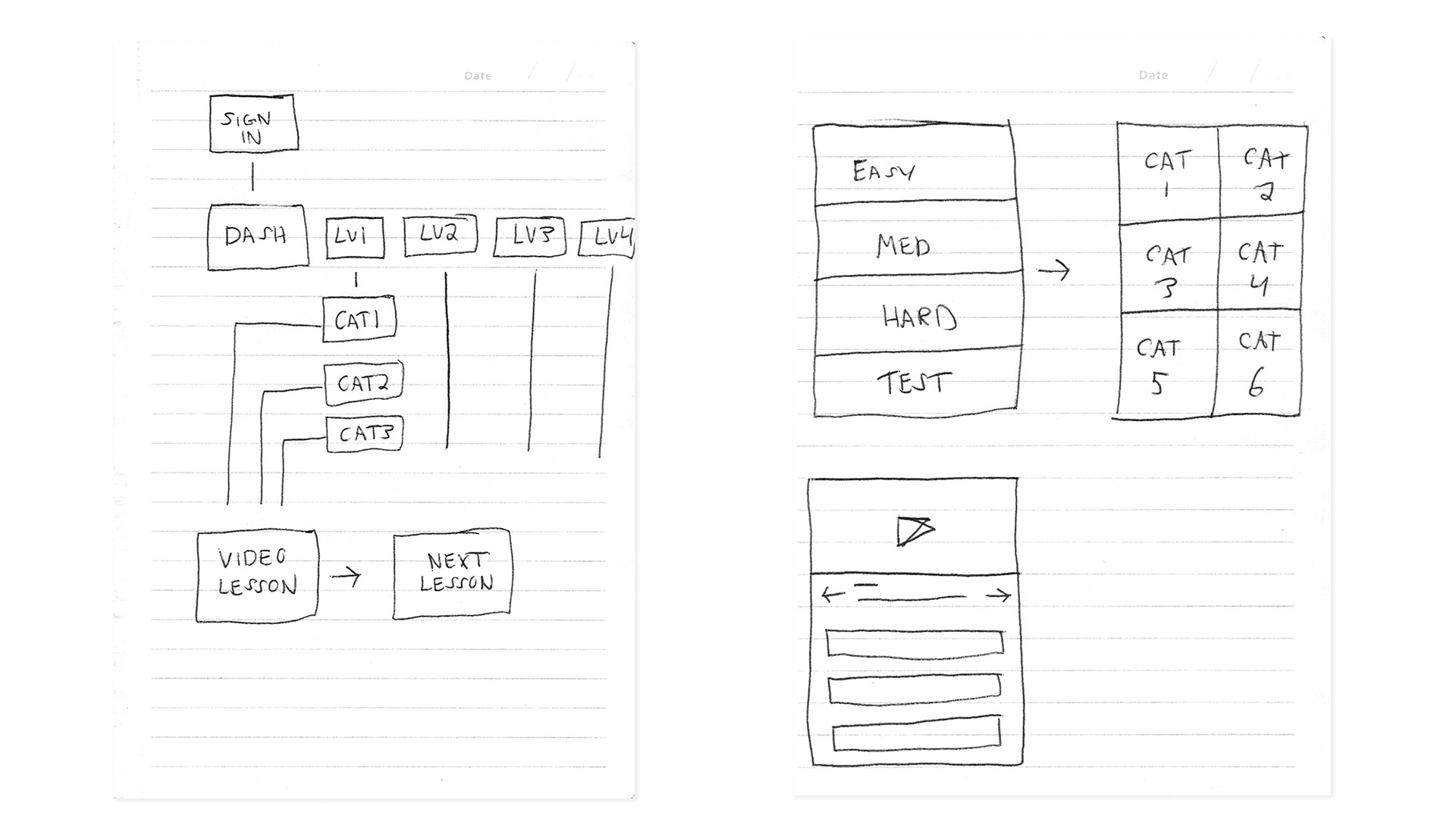
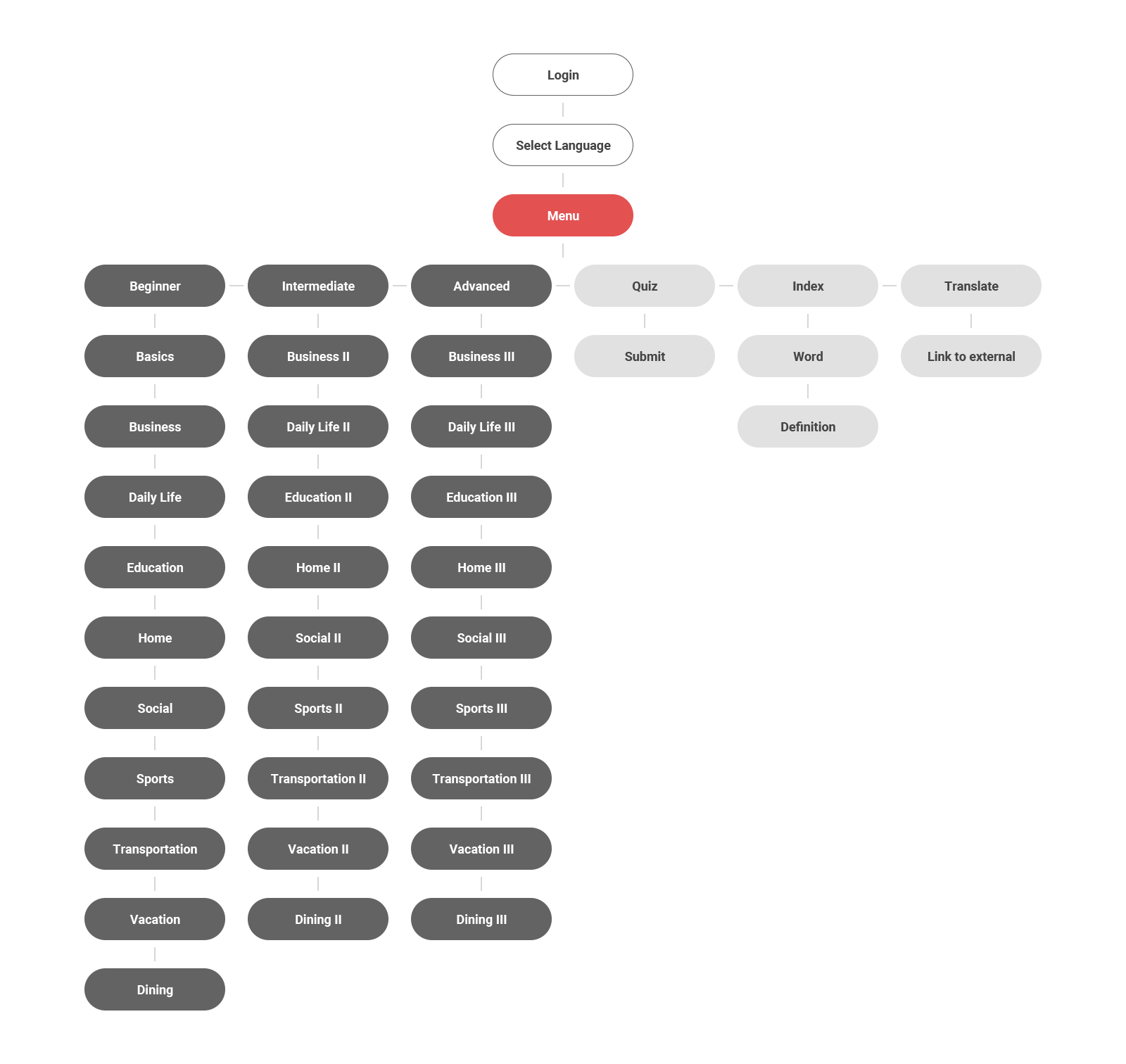
The first step was to do a quick wireframe of a new architecture and flow that would make more sense to the user.
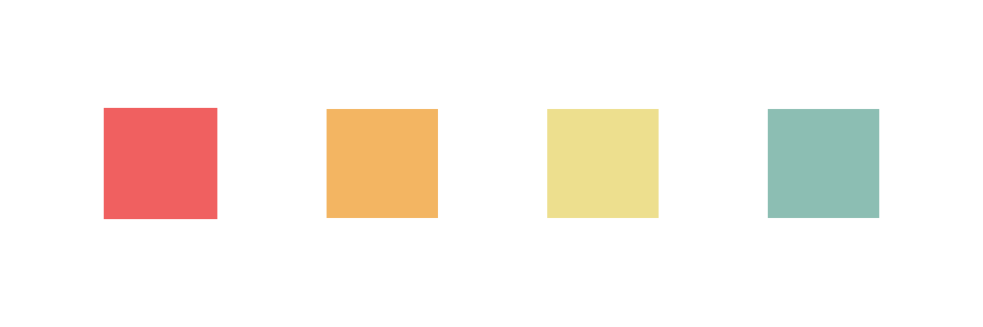
The Color Scheme
The next step was to create a color scheme that not only represented the new brand but also functioned as semantic colors for the UI. These colors would represent each section of the app that way the user would always know which section they were currently in.
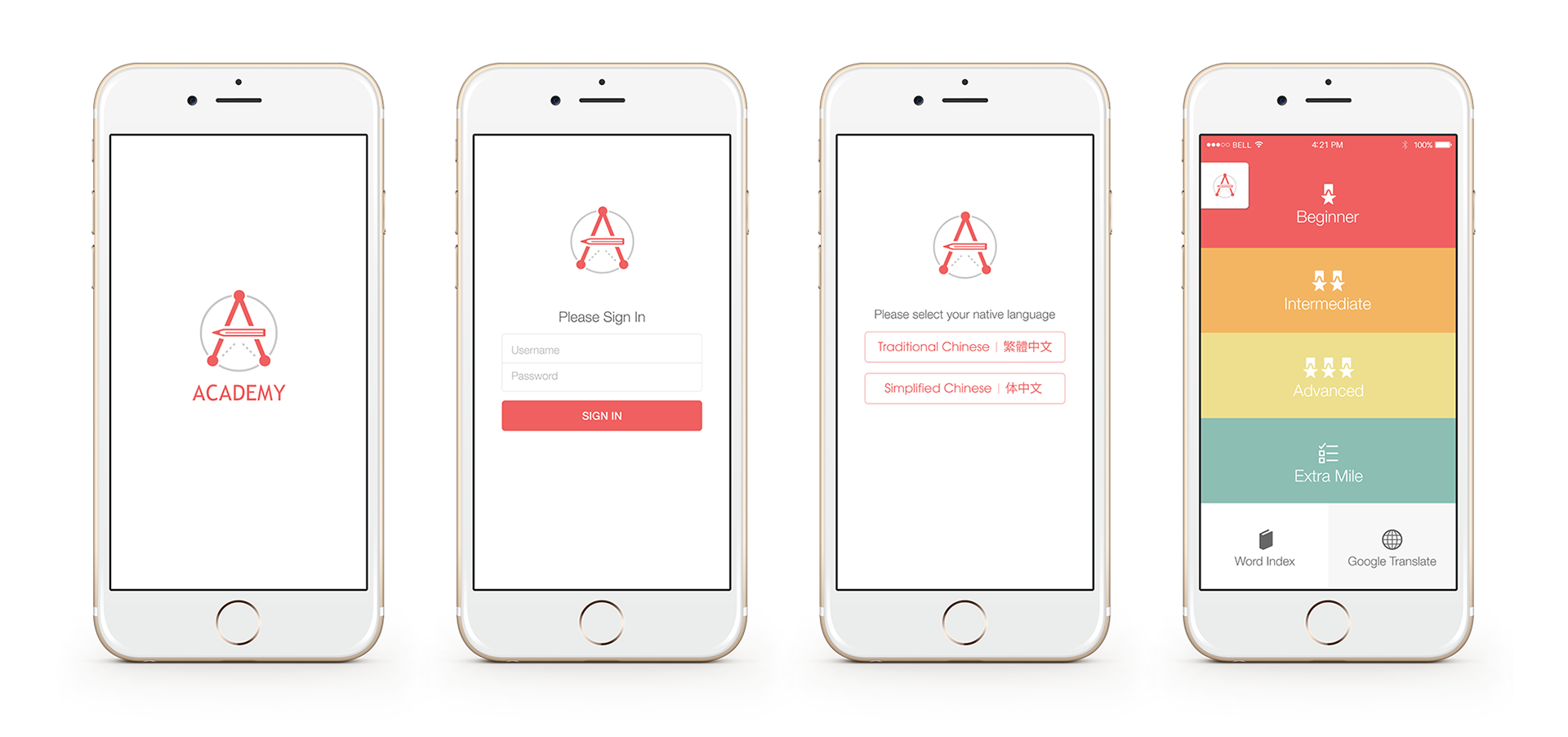
The Logo/Preloader
Next was to tackle the logo/identity. After creating a logo I decided to take it one step further and incorporate it into the UI. Since these videos were in HD, loading times would vary depending on the users connection. A custom preloader would help reinforce the brand and also let the user know the app was loading their next video.

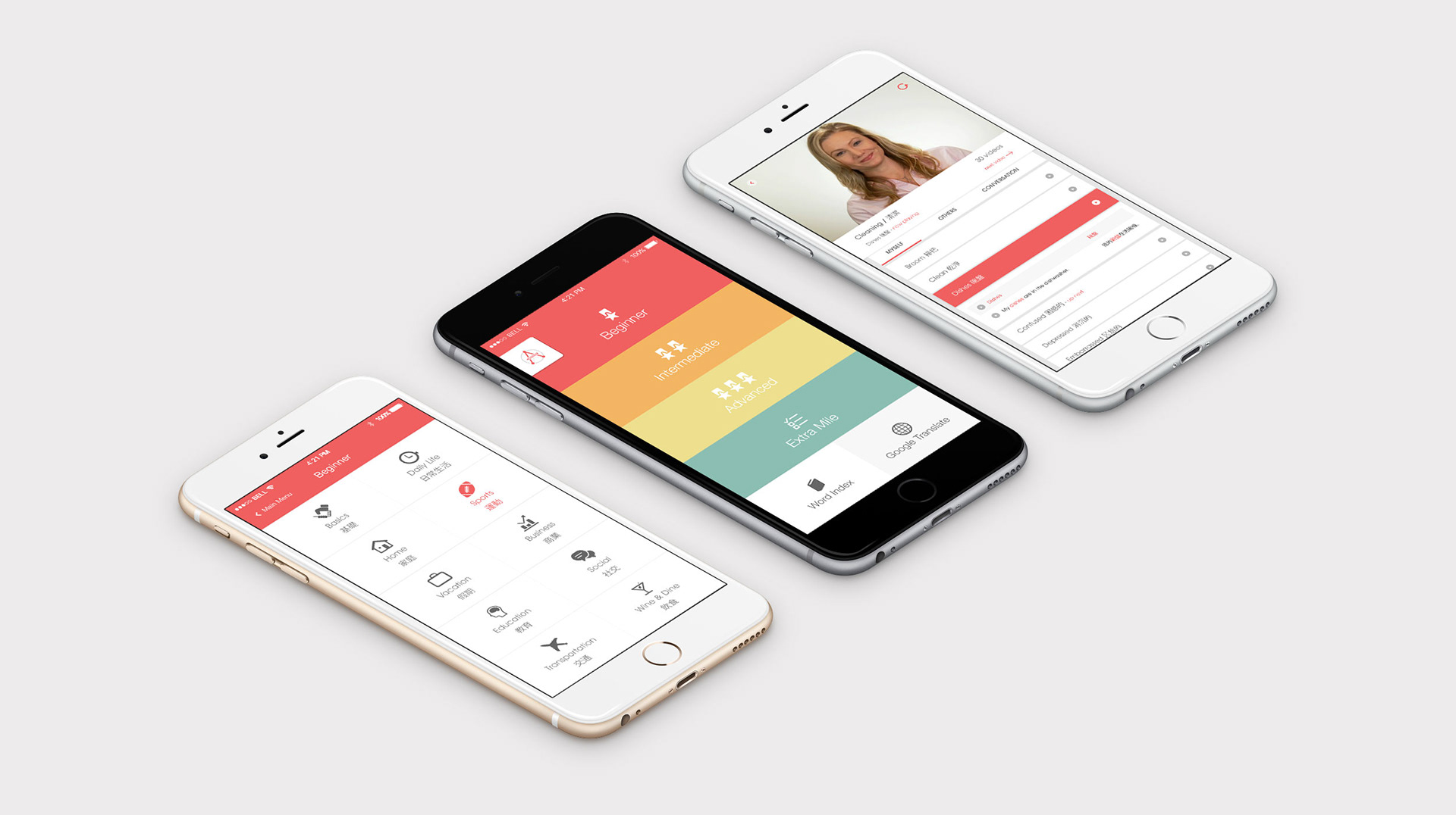
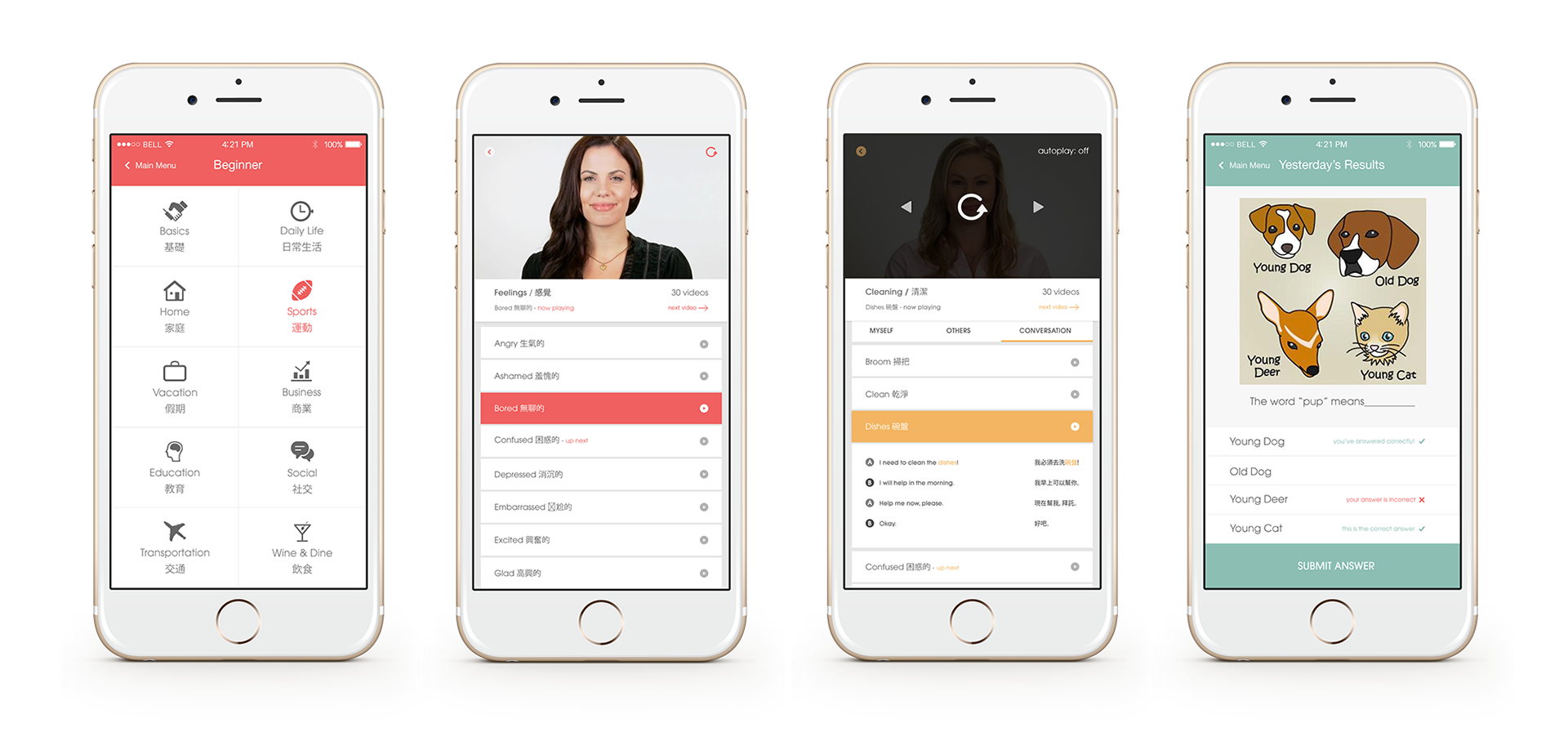
The User Interface
Next was to tackle the hi-fidelity design of the user interface. Since the focus of the app is to let users consume the video content, it would be best to keep the interface as simple as possible with a neutral color palette that would let the semantic colors serve their function.
The Results
The original website was confusing and lacked a logical structure and the data confirmed it. Users would randomly navigate to each clip without any particular order and their sessions would be under 5 minutes.
Turning this site into a native mobile app was a right choice. Users would feel more engaged and the platform made it convenient for them to start a lesson and return to it a later time if need. Data showed a more cohesive user experience with most users starting a lesson and completing it within 1-2 sessions.